Design vision product vision
TBD.
I was leading the product design team as a player coach. I liked this project, as it showed how design can go beyond the immediate execution, be more strategic and drive the longer term vision for the product and the company.
Overall Krisp had fairly low maturity as a company (series-A), we discovered the product and the business while building the org at the same time, doing some major pivots based on tech breakthroughs. Besides designing some key features, I implemented things like design process and basic user research.
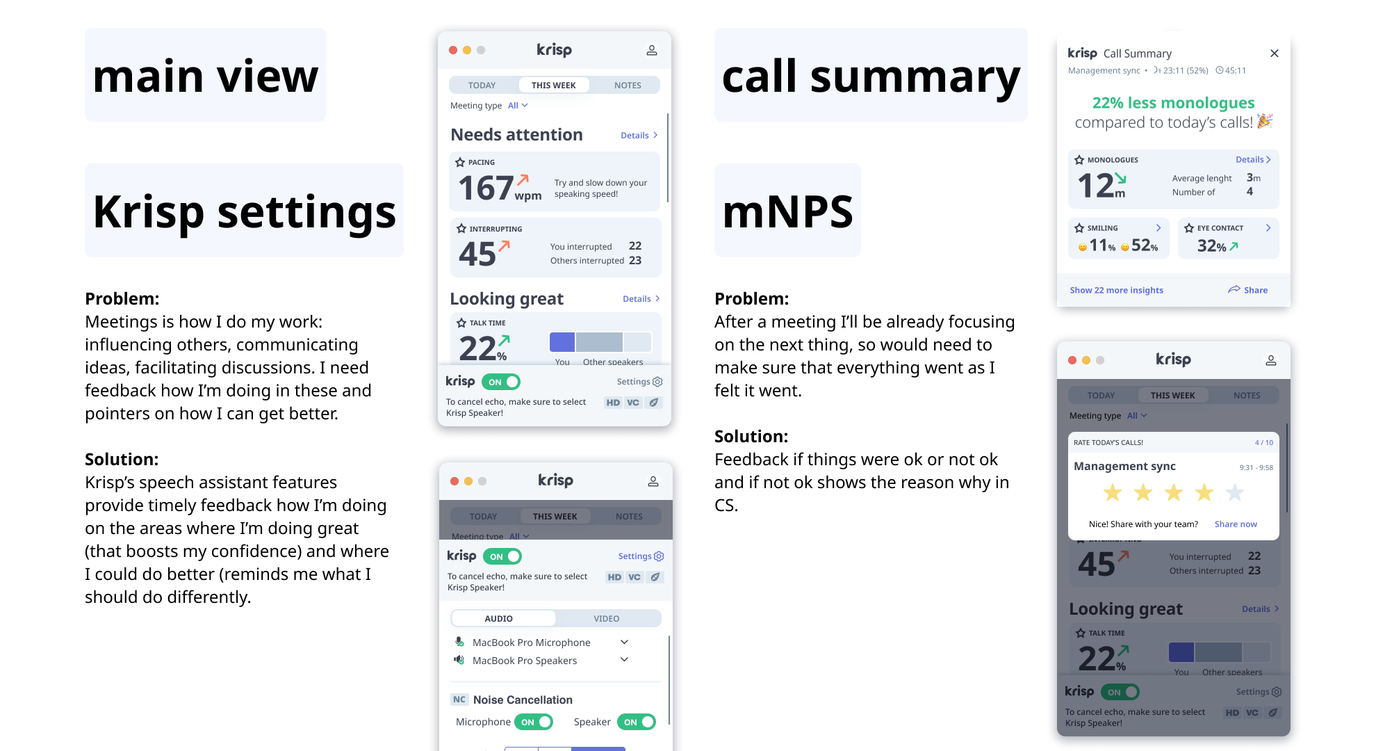
Krisp is a noise cancelling desktop app, besides a web dashboard the 3 main pieces were the app itself, a widget while on call and an end-of-call summary.
There were a few key challenges:
- Technology driven features - whatever the tech research team created, we tried to “productize”, needed customer input, clearer value.
- Broken user journey, few main interactions in place, but no unified flow, unclear what to do next.
- Founder’s vision not well articulated, many ideas flowing around.
- Bunch of user problems, like how do you know Krisp is working on your call?
- We wanted to have a stronger, broader product market fit besides noise cancellation
So I took on a challenge to create a product vision:
- Create a few key interactions that would showcase how we imagine the future, where the product could go in 1-2 years
- to motivate and energise the team,
- allow for better prioritization (both tech and product team) and a basis for detailed design and discovery.
- bring the ideas together we had,
- and the solutions to the user problems we saw.
I partnered with the product director and we had one of the founders as the stakeholder for the project. We had 4 weeks, so idea was to stay on a low visual+interaction fidelity level, while show what we want in a compelling way. We had an all-employee offsite, people were flying in, so the timing was strict.
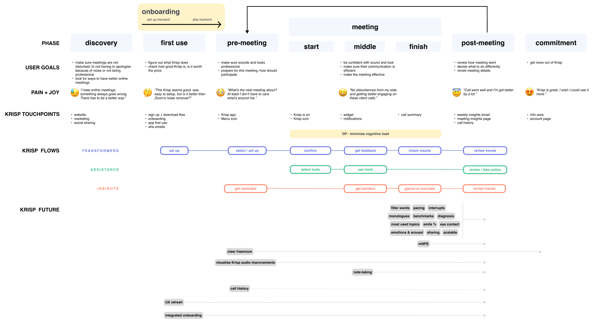
Since everything was so vague and we had a fixed time, I planned a highly iterative process: Each week a full iteration starting from the problem, the user journey, explore divergent interactions points and converge based on feedback to incorporate new insights learned while designing. This way I worked on the whole problem-solution space at once, and already had something workable by the end of the first week.
Iterations were driven by:
- stakeholder feedback,
- working with the rest of the design team (studios and critiques)
- feedback from other relevant people I met in the office (reaching out to engineering, tech, product, product marketing),
- also from some users from the sessions we had lined up (not very rigorous, but mostly focusing on journey issues and mostly non-users).
Also had input from earlier user research, previous explorations, and competitor review - these were summarized on the user journey that both showed where we are lacking, where we should elevate the experience and how the new ideas fit into the big picture. The major user journey iterations I had slowly incorporated all the different types of information we had - like onboarding was a quite big problem that had to have a clearer place and connections to the rest of the flow.
One example how the key interaction points evolved from the original to the final version, explored significant directions, what would work for Krisp’s future.
- Started from a sort of settings app as the original.
- In v1 established connections with other journey points (call summary and widget), explored a settings tab, and made a today view
- In v2 we tried if we can make something more collaboration focused, like participants, meeting transcript, that gave us the idea of what if we could show users who they were happier with or more energized.
- In v3 we brought the speech coaching angle forward - it turned out meeting collaboration is less feasible for us on the shorter term, and speech coaching was a clear user problem that we could easily work with, since we had access to the audio stream.
Had a lot of fun thinking on some of the finer interactions, like how the settings tab would change when something happened, how the app would look like while on call etc. Also explored some visual changes that we could later use when the app switched to Electron.
Finally we explored and settled on the speech coaching direction - since we had access to the audio stream, and it was a clear user problem.
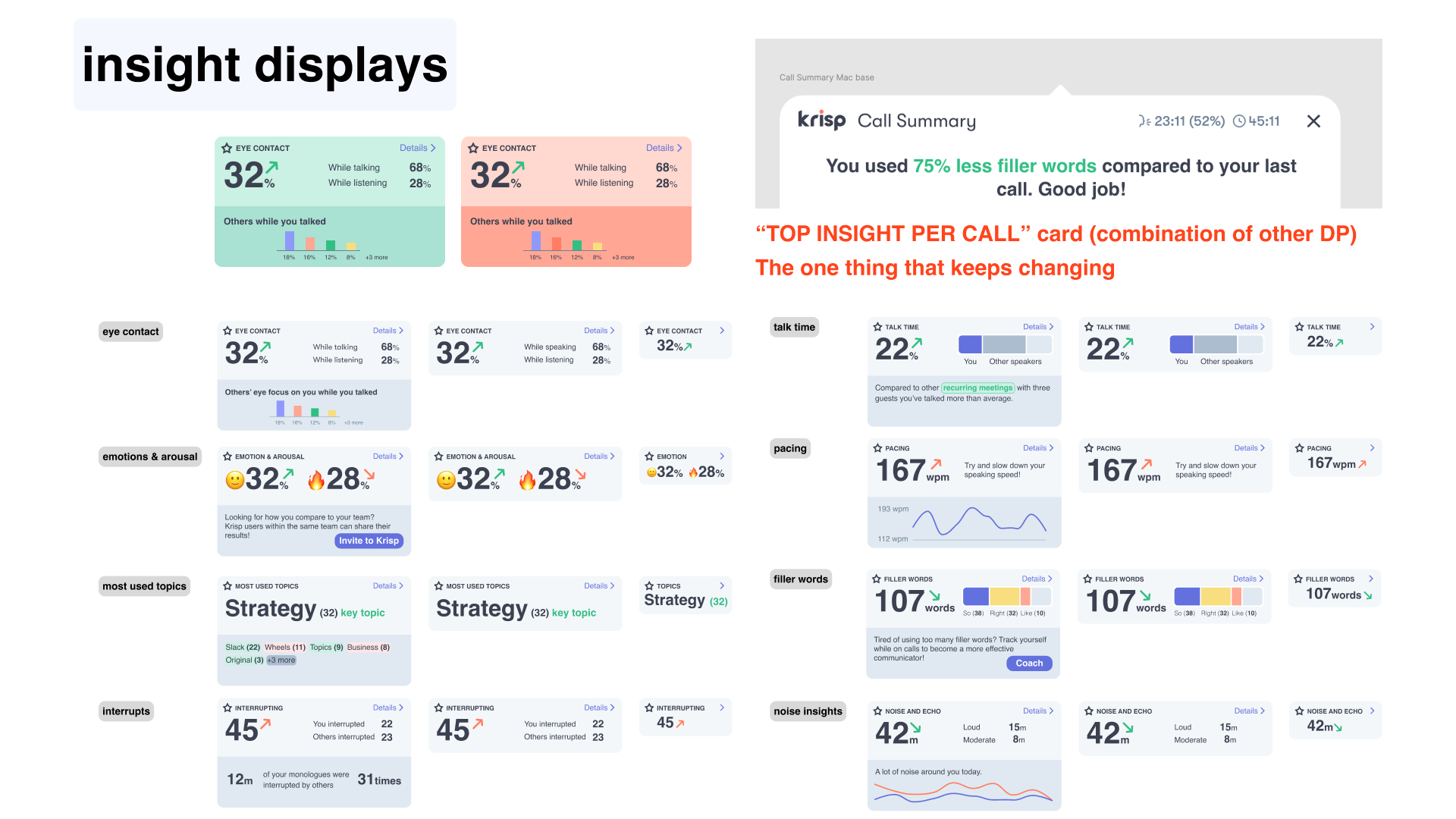
Since speech coaching became the main thing, we did an inventory with the tech team on what were the main metrics we could collect on the medium term.
I sketched up some variations for all of them, visual exploring not only what was possible technically but what could be desirable for the users to understand. The goal was also to not just have one-off displays, but to create a system and have some consistency over touchpoints, like how it would be shown during meeting, after meeting and overall analytics.
For example we had the realisation that we could easily detect interruptions - but it’s more important to detect monologues, so these were good learnings.
Some of these explorations (like filler words) drove the tech research team’s roadmap later - which was a radical change from earlier when we mostly just productized what came out of them.
Final design. Some points removed to showcase the most energising parts. The main UI, the in-call and post-call experiences and an additional 1 step ahead of the expanded UI.
Shared on the all-hands, pretty good reaction. Also created a clickable prototype with some neat interactions to share afterwards - it needed to be spread.
Measured the outcome in two ways - people talking to me about it afterwards (some nice one, especially from senior people), and if it was referred to later (less so, so story part could have been stronger), but it did create new ideas (for example the monologue feature mentioned earlier).
Did we win? Well, no :). Or yes, depends on what we count as success.
We did start some projects based on what we learned and established here (two slides if interested), and as we started a tech migration project afterwards (electron), the exercise was useful as it could resolve some of the journey problems we had.
A few months after this was presented and as the whole team and the founders could get a taste how things would work, we realised the speech assistant angle is not the right one. So pivot - projects were put on hold and teams switched to a new direction - meeting assistant. So the vision had impact on our thinking and the overall strategy. It helped the ideas to “settle”, so ideas could be viewed in a different light. Partly based on the explorations the new direction was meeting assistant (that piece survived) at least.
What did I learn?
- Design has a huge advantage, as it can bring ideas to life. This is prediction, we can show and tell about the future.
- Story is more important than it seems, as it binds together the pieces.
- Once again showed that ideas are only as good as they create new ideas
- Moving fast, establishing strict iteration drivers early helps, focusing on key interactions helps (didn’t spend too much time on figuring out our Greys or things like account admin).
Call Summary - Filler words and Pace was launched - but never got out of beta.
Based on vision started to have a more dynamic Call Summary, adding some metrics, giving sorta opinionated feedback to users, interactions (was important for better measurement and to be able to have more info, be both glancable and informative).
User feedback was great (people clicking within the summary and leaving feedback), but we had tech problems (was not Electron ready, and consumed too much CPU), and was cut.
Widget future design was stopped just as we had the first design iteration ready.
Updated app with active state (tie widget to the app, rather than being somewhere - people kept losing it, also wtf is a “widget”?). Widget less like a “box”, more like an active element (inspired by Grammarly, funny how they have pivoted), able to show what is happening and contain features, a better “in-call experience” if we wanted to compete on experience.
Droved discussion with research tech - what should they research (for example we didn’t had classifiers for known noises, also had to understand what data we want to show), did some usability tests,