Clashing Design Principles to Annoy You
From time to time I find myself obsessed with broken things, especially physical objects. The ones that leave me in an interrupted, annoyed, confused state whenever I use them.
Take for example this bathroom button. (I was told earlier that I speak too much about bathroom stuff, but it’s such an interesting topic. People are usually embarrassed to talk about it, although everybody uses it quite frequently, thus it has a big impact on our daily life.)
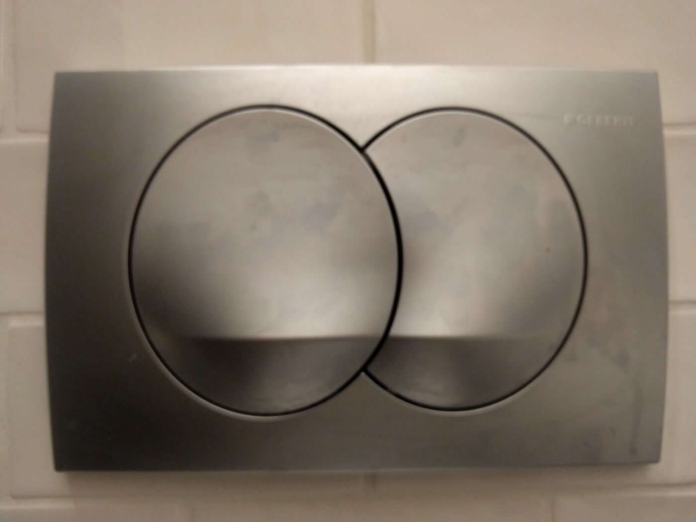
I never know which button push. Whenever I’m in this annoyed state I try to understand what’s happening. For this one, I realized that I have two conflicting concepts on what should happen.
Maybe the size of the button regulates the amount water I’d get, so bigger button means more water. This would make it an example of the natural mapping principle (by Don Norman), as it establishes a connection between the control and the real world. I love this principle, as objects following it elegantly help people apply their mental model to new situation, helping them understand faster and easier what is it that they see. It also lowers human error simple by making a connection between perception and motion control, linking the two closer together.
Now my other idea would be that since this two button design has the intention to conserve water. The designer made one option feel like the more obvious one by making it more prominent, bigger or simply put, the default one. This would make users push it more often (if they push the elements randomly the bigger button would get more pushes), we would get less water used overall. So if I push the bigger (default) button, I’d get less water in this case too.. This would be the default effect in practice, as most of the users would use the default option, achieving the goal the designer intended here.
I kinda hope you are now also confused on which button to press (not that I had the intention to confuse anybody).
One of the exciting things in designing stuff is answering such questions: which principle should be followed here? Most of the time when we are creating experiences (not just digital), and even with careful and thoughtful design sessions based on real user and business needs we arrive at such an argument. We have to make a choice which design alternative to pursue.
My obvious answer is easy just test it. Set up an experiment, and observe somehow which buttons get pushed more times, and what were people thinking and expecting when they pushed it. (Sounds like a fun experiment to create btw, an observation where you want to reaaaaly avoid to actually observe). This would lead to the insight on which principle to follow. Although I have the educated guess in this case that even without observing other people, there would be an easy design fix for it. Just put some icons on each button, maybe that would make the design less “clean”, but it would be also more understandable. But as far as design goes educated guesses are just slightly better than random guesses (and in some cases there are even worse).
So please designer-creating-bathroom-buttons. Test your stuff, you might get surprised. And maybe I’ll get annoyed less often.