Things learned at the IxD ’16 Camp
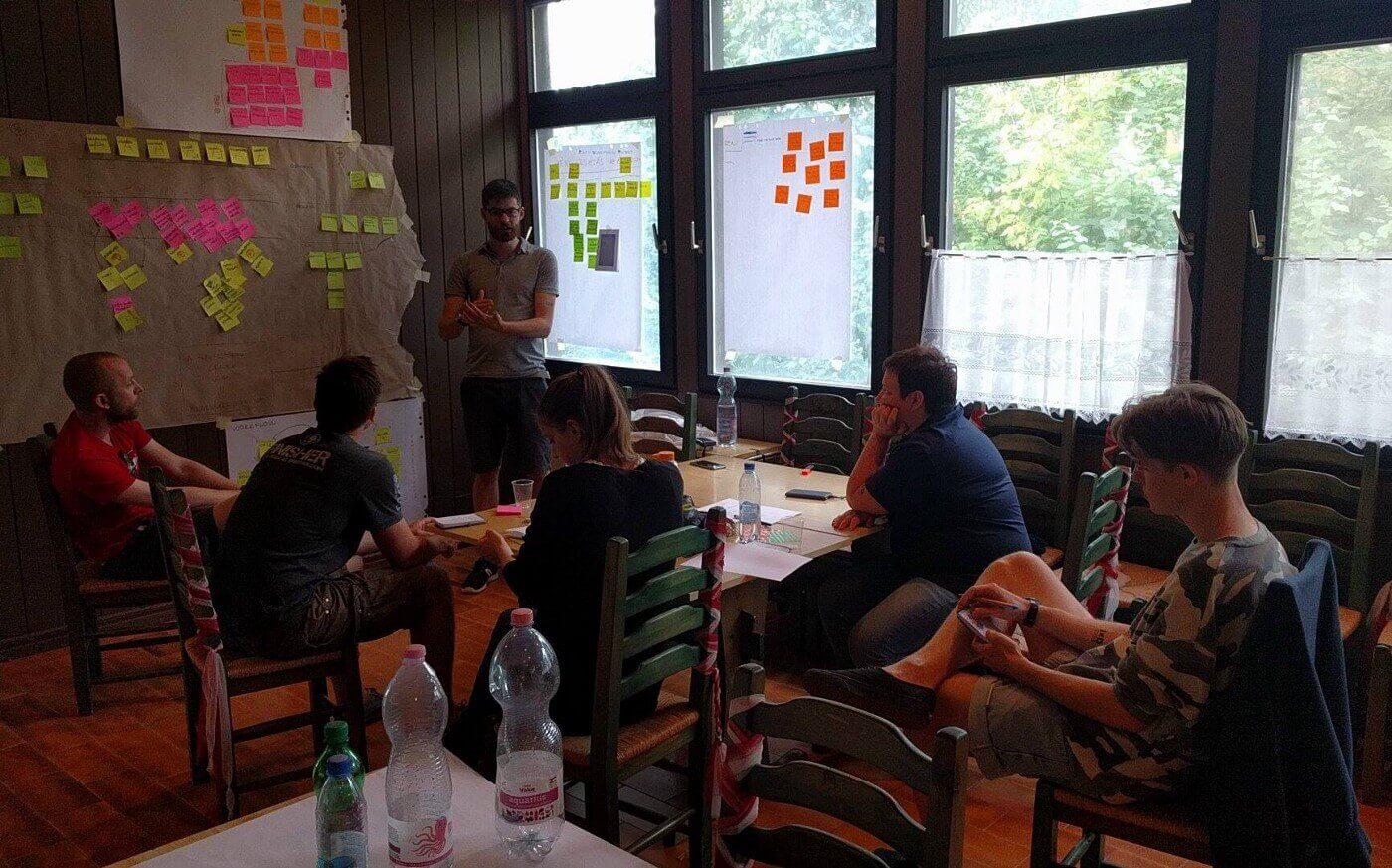
A few weeks ago I participated in a design camp organized by the MOME interaction design people. I was as one of the mentors, co-leading a team of designers with Eszter Könczöl. During the 3 days spent there we went through a full design thinking process, from researched user problems to full prototypes.
As far as experiences go, it was inspiring, exhausting, energizing, difficult, surprising, filled with passion, debates, lows and highs — so just like a real life project, only super condensed. Maybe because of the intensity, this camp highlighted a few things about the collaborative design process in unusual clarity.
Field work will surprise you, and reshape your expectations
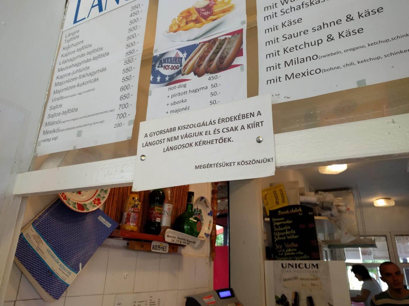
We started the first day by listing the team’s interests and expectations around some pre-defined topics. This was to make sure everybody had motivation for the task at hand. The next step was to go out of the building and to talk to people to empathize and to find out what were their problems and to have a general understanding of their context.
When starting out, everybody from the team began to talk about potential solutions. Solutions to problems that existed based on our assumptions. So it was interesting to see how those solution ideas changed based on what we learned, and also how new categories of solutions appeared. Nice and clean solution ideas will fall before people’s messy everyday problems. As we began to understand more, it became clear that apps are not always the right answer to people’s problems (what a digital designer would suggest), and designers can and should think about changes of a wider scope.
To get this wider scope, we tried to open up our investigations, leave our assumptions behind by asking open ended questions and getting curios about everything. This open mindset coupled with the immersion into the problem space (we looked at problems near the camp’s venue) got us towards unexpected solutions.
Ideas evolve, converge and diverge all the time
We spent the full second day on ideation and working on the team’s concept, the design answer for the people’s problems we learned about the first day. During this we used various brainstorming methods, did a design studio and a few storyboards.
Even though we tried to generate as many ideas as possible, it was clear from the beginning that not all ideas were made equal. Some resonated with the team better, some combined other ideas in a novel and elegant way, while others were too far out of the team’s vision to have any meaningful impact.
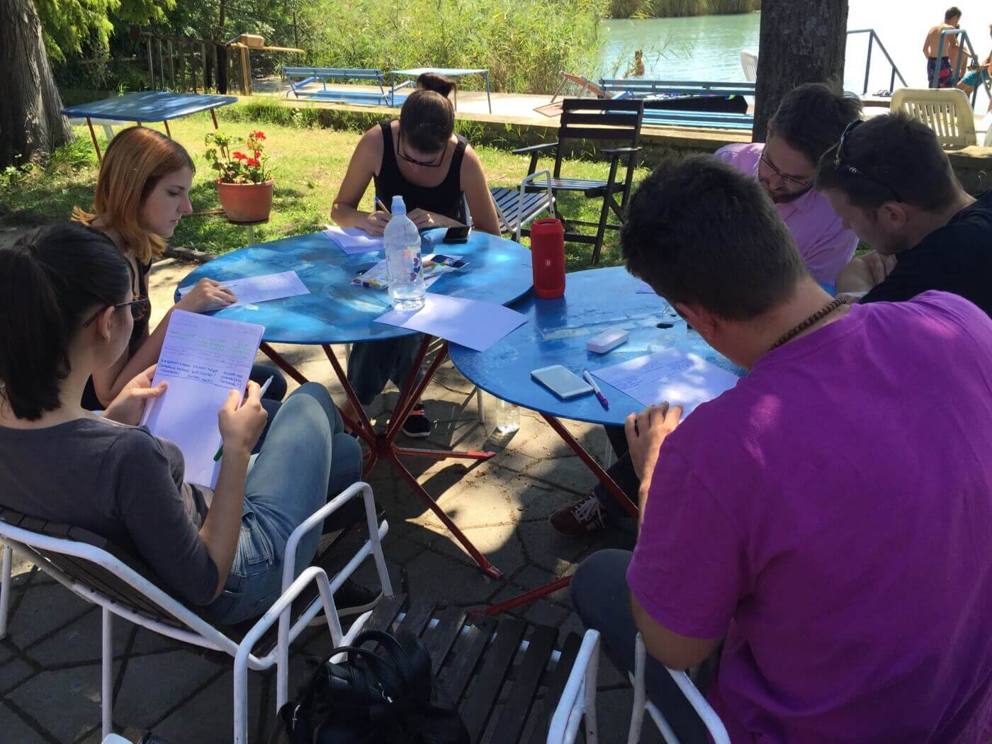
The tricky thing is to facilitate the team in a way that the best ideas get stronger and incorporate the good elements from the mediocre ideas. The empathy gained the first day helped a lot in this, but it’s also important to focus on the problems discovered. To keep this focus, the team had to be constantly reminded about the target user group. We even went back to our target persona when we realized our ideas were not heading anywhere. Our other tool was to iterate and get feedback several times, to make sure ideas got enough nurturing time.
Build prototype to give closure to your ideas
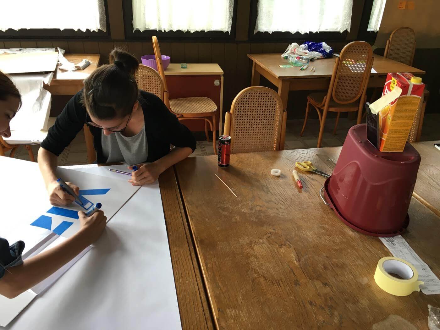
The third day was about creating tests and prototypes for our concept, a chaotic day of tinkering and hacking. But it was also the most exciting day, seeing the teams’ ideas translated into prototypes and in some cases even used by people.
This translation is also an important experience. The rest of the year we have so many ideas that don’t end up getting built. In general there are always more ideas (even great ones), than built products. You have to have more ideas to get better ideas. So every time something gets built, it brings such a nice warm feeling of completeness.
Besides the feeling it’s also about the mental space of designers. Once an idea got built, it won’t be in the back of your head any more, asking for attention and what-ifs. Building a prototype silences this voices and frees mental space to think on other ideas. Maybe even the next version of the same idea with a clearer intention.
If a picture is worth a 1,000 words, an interactive demo is worth 10,000
The highlight of the third day was the demo, every team presented their concepts and prototypes to the other teams. Usually such presentations are kinda boring, the team talking about their challenges, showing a bunch of pretty pictures and maybe a prototype that showcases the work that was done. In this camp however all the teams presented something interactive, where the audience could walk up and participate.
Interactive prototypes given to the audience is both terrifying (what can go wrong?) and exciting (seeing people using the product) for the presenter team. But it also tells more about your ideas than any presentation would do, as it simulates the experience your users would have. Words on slides give everyone different ideas how the final product would be, it doesn’t help creating an understanding between team members. Mockups and prototypes make everyone understand the experience users would see, but only within the team. Interactive prototypes enable the understanding within the team, and also between the team and the users.
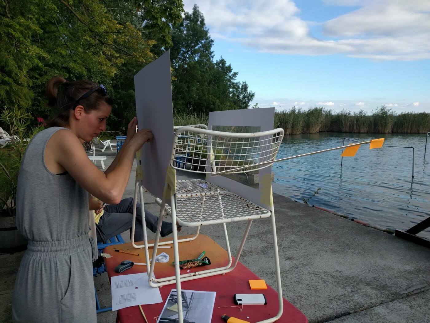
(I’m especially proud of my team, who built an analogue projection AR device, to showcase how the scene would change with some new buildings and objects added.)
The most fun prototype is the one with roleplay
From the demos one stood out, where the team decided to prototype the experience based on their concept and not the concept itself. They handed the audience role cards asking to act in different scenarios, while the team members manipulated the context. This approach highlighted the problems the team wanted to solve, and it also showed how their concept would change things for the better.
The key part here was to not only have an interactive experience, but also have immersion, as the audience roleplayed the target users, leaving their own assumptions behind. This approach also surfaced potential conflicts between users, since different people got different roles, and they had to play through their role and enter conflicts they maybe wouldn’t have other times.
I always believed in the power of roleplaying. This is why we want to have fully formed scenarios explained to the users on usability tests, to have more immersion and thus find more contextual issues. This demo showed me that such roleplay can be useful to have people enter a specific mindset, especially in collaborative exercises.
Methods are action templates
In this camp I got the task of talking about research and synthesis methods (like contextual inquiry and journey maps). By teaching a few methods we wanted to give tools to the teams, to help them in their design process. However, I rarely stop to think about the details of the methods I use, and I usually customize them based on the current needs. But this approach doesn’t work well when you want to teach novice designers under time pressure.
Methods provide useful action templates, implicitly including a variety of reasons why you need to do things in a certain way. These help to get started towards a specific goal (like to organize your facts about a user you can use an empathy map). This means you shouldn’t mix up or leave out method details if you don’t know what you are doing (like you have to make sure to not ask your research questions as your interview questions), stick to the template especially in the beginning.
On the other hand when using a method, you should think about your goals to make sure the method brings you into the right direction. Don’t be a template zombie, and don’t use any given method just because it offers a cool visualisation.
Finally your methods need to fit together to form a continuous process. It makes little sense to make interviews if you are not using the data afterwards, and even less sense to construct a persona, if you randomly brainstorm afterwards. Just like actions following each other in a method, your methods should also follow each other in a clear flow.
Include forming-storming-norming in your design thinking process
I usually lead design thinking workshops at my company, where people already know each other and work in the same team, or at least closely together. In the camp we had 6 persons in a team, barely knowing each other. As a mentor in the team I was focused on moving the design process forward, and realized too late that I forgot to care about group dynamics. Even with the smartest and most open people conflicts and sub optimal results are bound to happen if the group is not prepared to work together.
In the office we can start light, maybe just with a review of some general rules, like “put away your phone and laptop”. Even if everybody knows this, it’s useful to repeat, as it puts the people into right mindset, like a warm up exercise before the real work begins. While this is not included in the design thinking process itself, it should be the part of the set up and the introduction.
In the context of such a camp, it’s probably also useful to create some basic rules (like how and when the team would work together), and have everyone present agree. To address forming-storming and also to test the rules I’d choose some Gamestorming tools. The collaborative nature of these can quickly start the teamwork. They even have a game designed to create a Code of Conduct in case the rules prove difficult to set up.
Don’t be afraid to ask the question “how do you feel”
On of the best things I learned in the past year as a team leader is to frequently ask people how they feel. This brings forward tensions otherwise hidden, raises the empathy levels (both mine, and theirs), gets feedback and makes people think more about what they are doing — an important trait for designers.
Since I was focused so much on the process, I almost forgot this lesson in the camp. I was afraid of losing direction, and waste time while we had to make progress. I realized my mistake the second day and asked the team: “Let’s stop for a few minutes. Tell me how you feel right now!”. The energy around the table instantly changed. Empathy was raised as people became more aware of the others, and the discussion became a more open as we all realized we can reveal more about ourselves.
Design your methods equally for extroverts and introverts
As an introvert I always try to set up workshops in a way that lets everyone participate equally. As the design process moves along we need the the ideas and contribution from everybody to come up with the best concepts, and we also need diverse ideas, so similar team members won’t do. The difference between extroverts and introverts can lead to powerful team-ups, but both types need their own way of participating.
In the research phase pairing up an extrovert and an introvert can lead to more insights and deeper understanding. While the extroverts are better at getting people talking and react faster in some of the trickier situations, introverts make better observers, and notice less obvious patterns.
Collaborative design methods (like design studios) can include both extroverts and introverts, when the alone work and presentation/critique follow each other. But times allocated need to be balanced, as introverts will need time to reflect and recharge between more intensive discussions, so time facilitation is important.
Presentations may be the toughest for introverts, but as presentation is an important skill for every designer, you need to make sure it’s not just the extroverts’ playground. We tried to have everyone from the team present, but had them choose their own part, so everyone was comfortable.
Overall the camp was a great experience and a powerfull reminder of these ideas. See you next year in the IxD ’17 Camp!
This was my take on the IxD ‘16 Camp. On how the camp got organized read Thomas Fogarasy’s post “How Might We Design a Camp?”. If you are interested why we didn’t use digital tools, read Ákos Csertán’s post: “Throw away your computers”. Csaba Varga has a piece on the background of the Camp: “How We Created an Interaction Design Lab and Organized a Design Camp”. Gabor Suhajda, Bálint Ferenczi and Norbert Krizsán were also mentors in the camp.
Comments