Making a complex portfolio feel simple
As the lead designer for Ubuntu Pro a subscription bundle for a portfolio of products, my key challenge was to scale up the buying journey from product-level to portfolio-level. The pieces of the portfolio had been built independently over time, and the buying journey for self-service users needed to become a proper SaaS flow and cover the full portfolio instead of a single product. This mean updating both the messaging and how we presented the stack.
The first step was improving the pricing page, but this turned out to be much more than a page redesign.
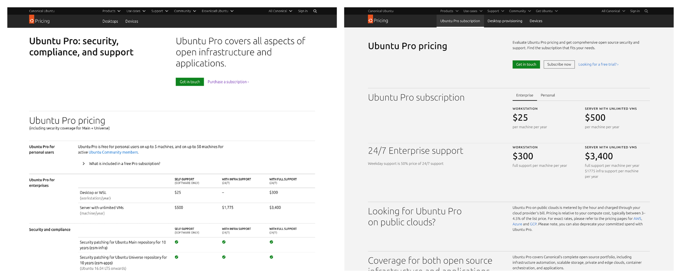
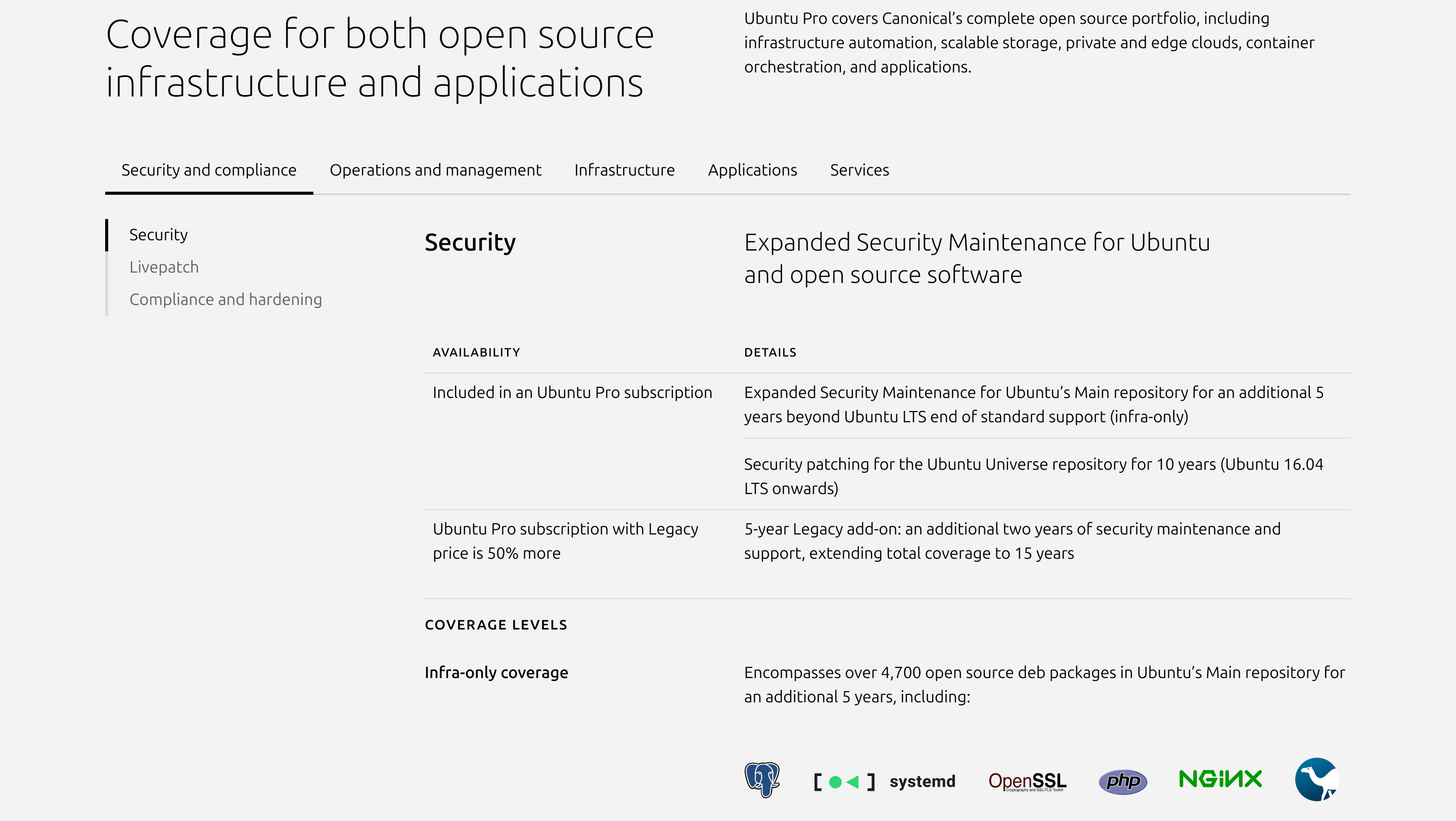
The earlier pricing page was created when the product was less complete. It had originally been useful for the sales team to highlight the simple pricing model, but over time the page didn’t follow the evolution of the offering. More critically, it didn’t show the full stack of what was covered. For a portfolio with deep technical breadth, this was a real problem, users couldn’t see what they were actually getting, and the sales team had also stopped using it.
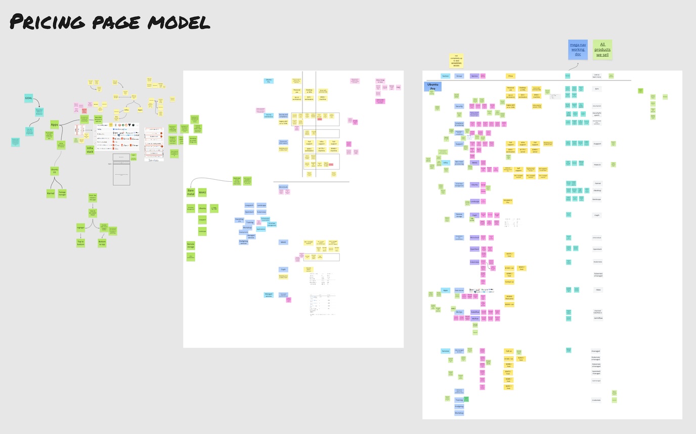
I needed to create a page that represented the full stack while being modular in approach, so we could easily add new modules as the offering evolved in the future. The next step was to understand how the current page performed, so I dived deep into analytics data, run a few simple measurements and did a round of interviews with customer facing teams. Based on the input I could come up with a new model to show the full stack offering and the pricing. To complement the data, I’ve collected product descriptions from 10+ different product teams to align how each part of the portfolio was presented. This alignment work, getting teams to agree on how their products fit into a coherent whole, was where the real complexity lived.
With the model in place, I focused on designing a page that provided a simple presentation for the underlying complexity. Since the page had to live within a broader marketing website that generally showed much simpler information, I worked closely with the visual team to redefine the presentation components creating patterns that could handle technical depth without overwhelming users unfamiliar with the full portfolio.
A/B testing showed that the new page converted ~10% better. But the outcome I found most telling was that the sales team started using the page again in their pitches, both to explain the offering to prospects and as simple documentation for customers on our pricing. When a page works for self-service users and sales conversations alike, it means the underlying model is doing its job.