Setting direction, down to the details
- Role
-

Lead Experience Designer
@Canonical ⊂ 2024 -
Services around Ubuntu Pro had been built over years by different teams, so they didn’t form a coherent experience. Resolving that has been my main mission at Canonical. After I joined I mapped the customer journey end to end, which made the fragmentation visible, and pitched to leadership what a single surface across the portfolio could look like. The direction was already forming, and my pitch shaped what the experience became. It became a project, a team, and a product: the next iteration of Ubuntu Pro.
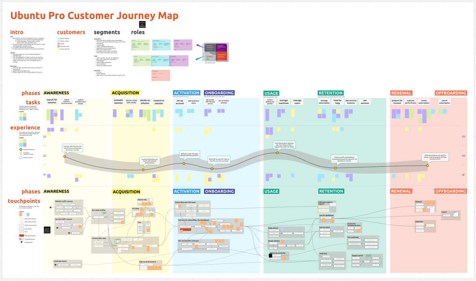
The end to end customer journey, which made the fragmentation and the friction points between services visible.
We set a three-year roadmap to bring seven services together on an enterprise-grade foundation. We’re a year in, releasing pieces and exploring ideas as we learn. At Canonical’s scale, aligning backend services and creating a coherent experience are the dominant cost, and I shaped my role to drive that down.
Agreeing on something that doesn’t exist yet
The first phase set the vision: how the project ties into the business strategy, what the shared surface should be, and what was technically feasible. I ran workshops, joined architecture discussions, and drew maps to visualise the tradeoffs. The framing we landed on was mechanisms for existing products to slot into a coherent view, a shared backplane teams build on that doesn’t make product decisions for them.
Teams had to agree about something that didn’t exist yet, so I had to make the work visible.
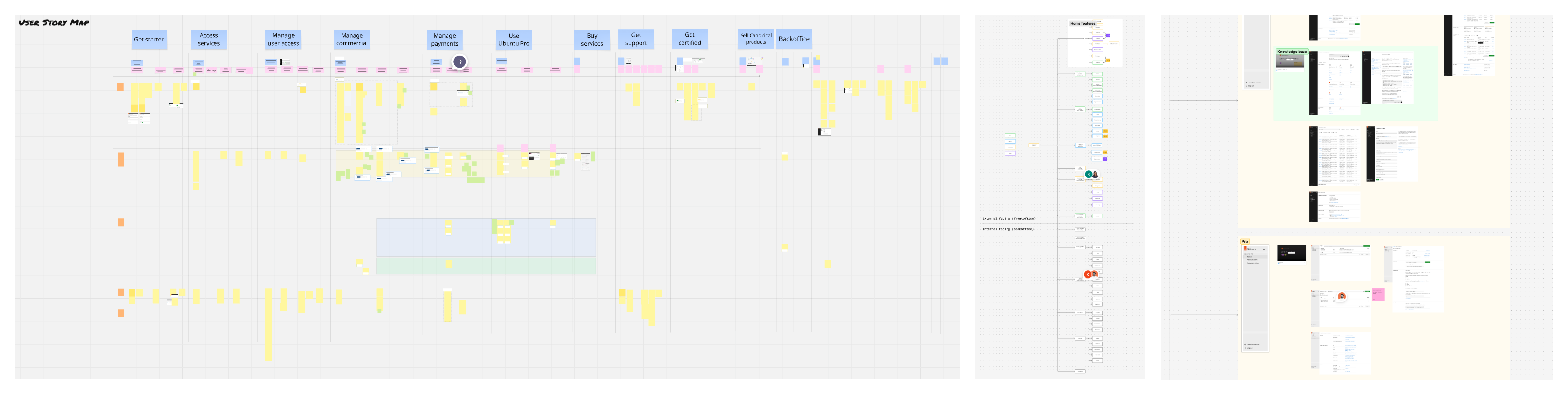
Story map to break down and prioritise, information architecture to align terminology across teams, user flows to show how screens connect.
I wrote specifications, modelled permissions with the product manager, and drew the flow and information architecture maps. I run a weekly strategy session with the product manager, the engineering manager and the architect, so the long-term picture keeps developing while we deliver. I lead four designers on the shared surface and work with the wider team on how their services join. I design some surfaces myself, coordinate the rest, and run generative and evaluative research.
A prototype that holds the whole roadmap
Maps settle terminology and sequence, but they don’t show a screen. I built the whole experience as a working prototype with coding agents. It carries the current scope and shows how the pieces connect to the long-term picture, so conversations can move between what ships next and what comes later. We build the minimum now without closing off the rest.
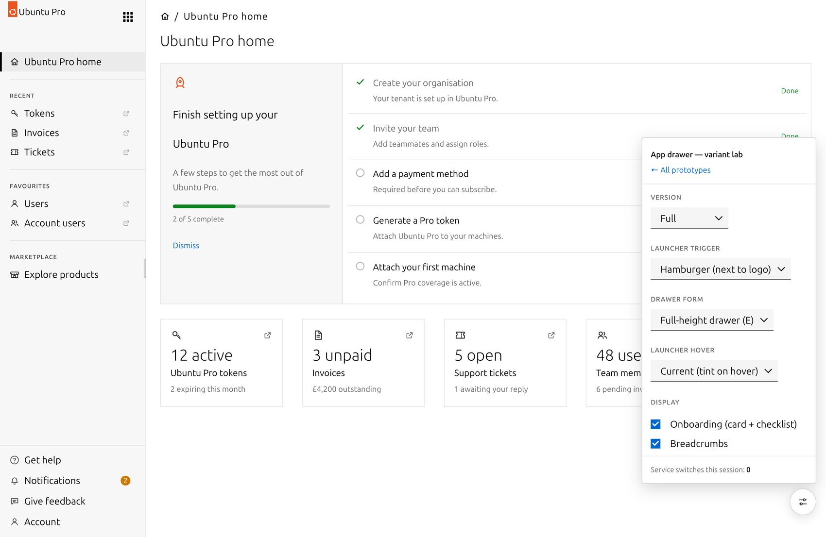
Home page, with current, near term and long term features sketched in, and the variant lab showing the alternative explorations. Service names replaced for publication.
This changed how we work through problems. I try alternatives during sessions and see how each one lands across the whole prototype. A variant lab sits on top of it, so explorations live in code rather than in a deck and we switch between them while talking. The prototype has about a hundred screens, and it also drives specifications and detailed designs.
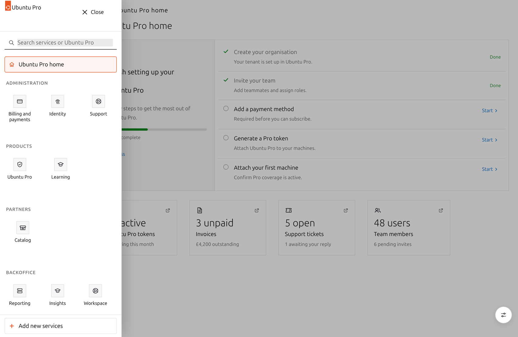
One of the switcher explorations: a full-height drawer grouping every service a customer can reach.
Once the experience is in front of people, the decisions behind it get easier to settle. Questions about identity, tenancy or where a service boundary sits stop being architecture debates and become questions about something on screen. It also surfaces the questions we hadn’t thought to ask.
I can rebuild a screen while the discussion is still running, so the answer is in front of everyone before the meeting ends.
Design systems miss the coherence layer
Canonical has a mature design system with tokens and consistent components. The design team cared about coherence inside each service, but not across them, where a journey crosses from one service to the next.
That’s the middle layer of design system work, and it’s where coherence comes from. Consistent components aren’t the point of a design system; a coherent experience is, and components alone can’t deliver one.
I’m shaping that layer from the patterns I saw emerging and what the next pages needed, and contributing these to the design system as layout patterns, a new category between the component library and the journeys it serves.
They’re specified as structure, not styling. The look comes from components that already exist; what was missing was the arrangement: which regions a page has, where the primary action sits, how one service hands over to the next.
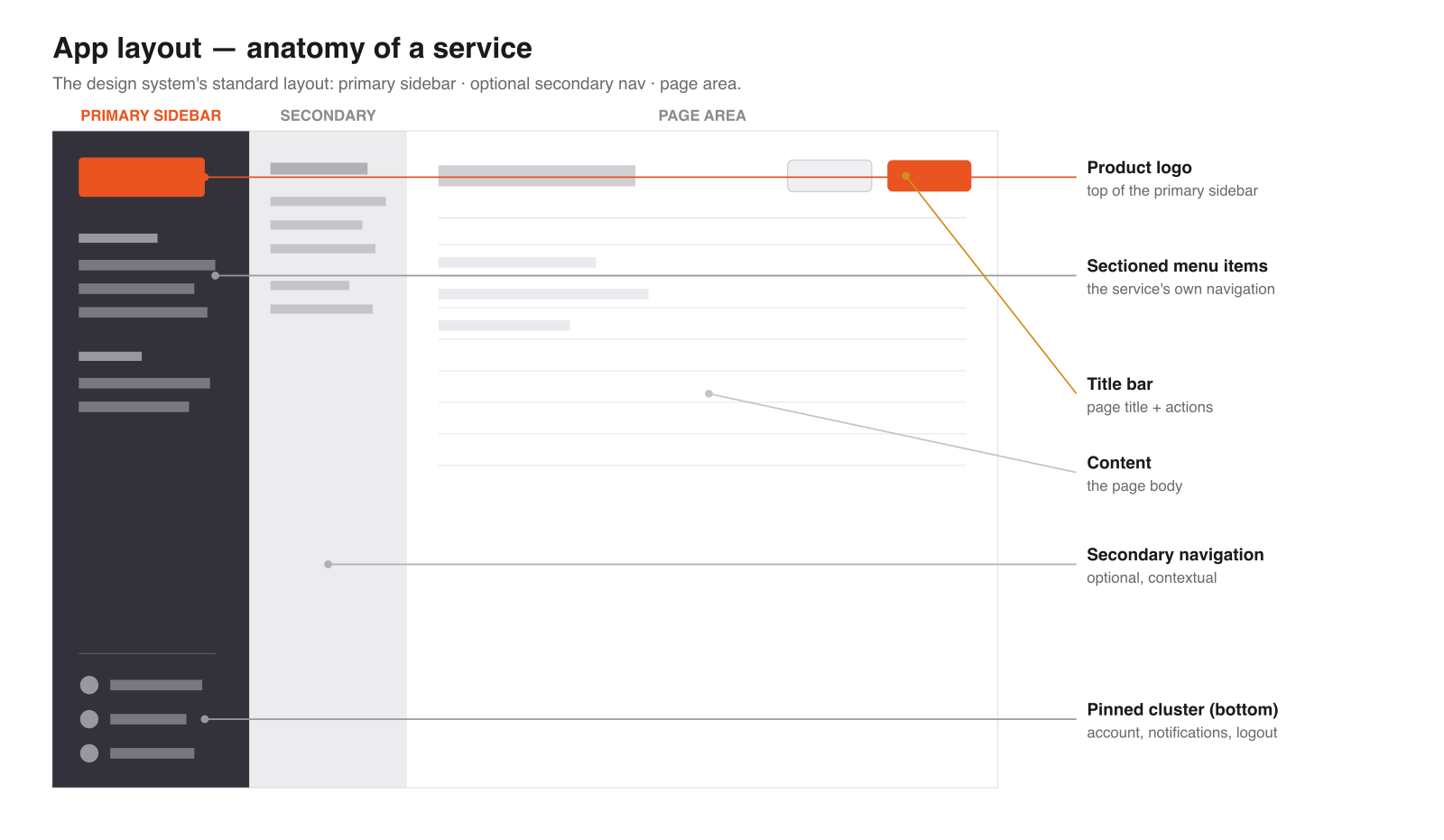
The layout every service shares, written down so a customer moving between them stays oriented.
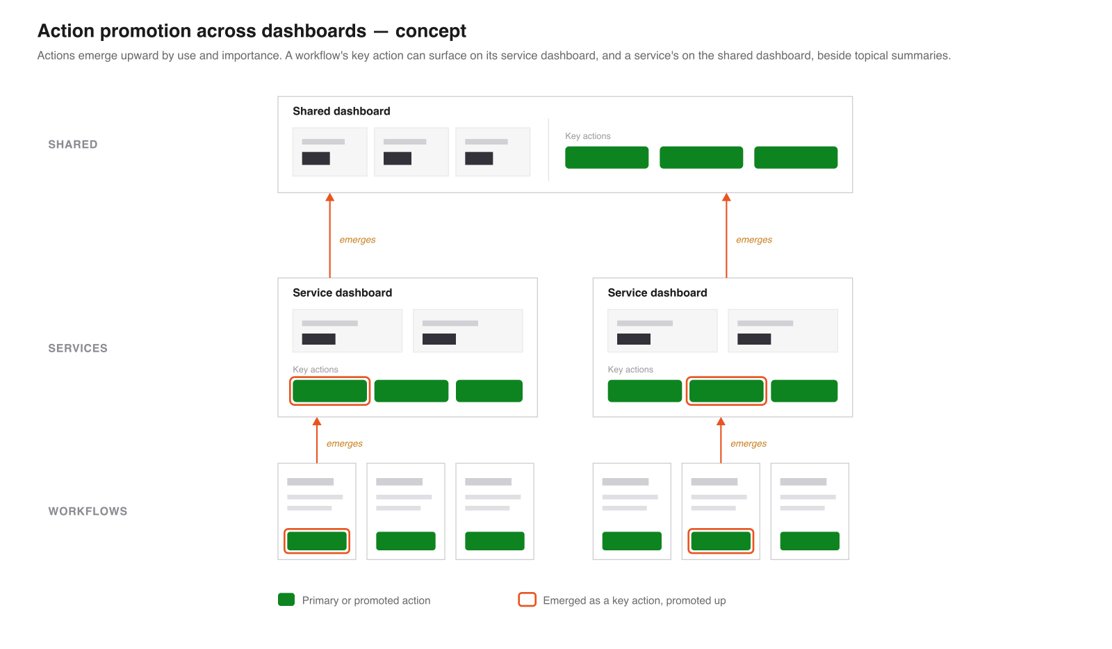
How a key action earns its way up from a workflow to a service dashboard, and from there to the shared one.
A year in, work is in progress
We’re releasing against the roadmap now. The maps, the prototype and the pattern work are what designers and engineers work from, and the near-term plan and the long-term picture still describe the same product. Keeping the vision in something people can use is how I set direction, both for what the product ships next and for what the design system has to become to carry it.
- 7 services
- brought together
- 4 designers
- on the shared surface
- year 1 of 3
- releasing throughout